Crypto Thumbnail System for Whale Manipulation (2026 Guide)
Learn how to design crypto thumbnails with whale manipulation visuals, dark aesthetics, and AI iteration to improve CTR and clarity.

Crypto content competition has shifted from information scarcity to visual overload. High-saturation thumbnails once dominated, but repeated patterns have reduced their effectiveness as users adapt to similar visual cues across platforms.
This guide focuses on building a structured thumbnail system using whale manipulation concepts, layered design, and iterative testing. The objective is consistent performance improvement through repeatable visual frameworks rather than one-off designs.
In This Guide
Step-by-Step Guide
Establish a Fixed Base Layer
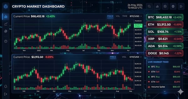
Define a consistent base using a dark gradient background, typically in the range of #050510 to #0A0E27. Add a subtle grid with 5–8% opacity to simulate chart depth and structure.
This base should remain unchanged across all thumbnails. Consistency in background and layout creates recognition over time and reduces cognitive load for repeat viewers.
Standardize Data and Chart Rendering
Use candlestick colors with muted saturation, typically green (#00C48C) and red (#FF4757) at around 70% opacity. Ensure chart elements remain secondary to the headline but still visually present.
This creates a balance between data accuracy and readability. The chart provides context, while the headline communicates the main idea.
Assign Visual Metaphors to Whale Behavior
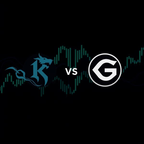
Map each market behavior to a specific visual: spoofing as ghost liquidity walls, pump and dump as a spike followed by collapse, and liquidity drain as fading or emptying zones.
Each concept should have a repeatable visual pattern. This ensures that viewers can instantly identify the topic without reading, improving click efficiency.
Apply Accent Layers for Differentiation
Use distinct accent colors for each concept: electric blue for spoofing, purple for wash trading, neon green and red for pump and dump, amber for stop-loss hunts, teal for liquidity drain, and near-black for dark pools.
Accents should represent the narrative layer of the thumbnail. Keep them minimal but high-contrast so they guide attention without overwhelming the design.
Iterate at Scale and Optimize
Generate 24–36 variations per thumbnail concept and evaluate based on click-through rate and retention. Adjust variables such as text placement, contrast, and visual intensity.
Iteration should be systematic. Over time, performance data will reveal which combinations of layout, color, and text produce the highest engagement, allowing the system to improve continuously.
Tips and Best Practices
- Always test with small amounts before committing significant funds.
- Bookmark the official websites of tools mentioned in this guide to avoid phishing.
- Keep detailed records of your transactions for tax reporting purposes.
Ready to start trading?
Trade on Bitget Try CoinTech2uAffiliate links — we may earn a commission at no extra cost to you.
Frequently Asked Questions
How many variations should I generate per thumbnail?
Generating 24–36 variations provides enough data to identify high-performing designs.
Why use a dark base instead of bright colors?
Dark bases increase contrast, reduce fatigue, and improve visibility of accent elements.
What is the most important factor in thumbnail performance?
Clear hierarchy between background, data, accent, and text is the primary driver of performance.
Related Articles
- CryptoTakeProfit Cover Art Guide 2026: AI Thumbnail Automation System
- STEP 1: Choose the Right Screen Recorder
- 10 Best Crypto Tools for Gen Z in 2026: Beginner-to-Pro Guide